
Project Title + Year
Transit Museum Society 40th Anniversary Collection, 2025
Role
Designer
Discipline(s)
Graphic Design, Visual Identity, Branding
Project Overview
This project aims to create a design that can be applied to a range of merchandise to celebrate the Transit Museum Society’s upcoming 40th anniversary, which may either be distributed to members and volunteers within the organization or sold to the public online and/or at events for proceeds.
Tools & Technologies
Adobe Illustrator
Conceptual Framework
The design is meant to be scalable so it can be applied to various pieces of merchandise of varying sizes, including apparel, accessories, and giftware, primarily via print. Adobe Illustrator was solely used to create vector files, while Adobe Photoshop will be used to create mockups of the design on various products.
Design Process
Creative Direction and Conceptualization
The overall design was inspired by the current logo of the society, which was based on that of a predecessor agency to the modern-day BC Transit and TransLink. For consistency, the same overall concept was applied to this design, specifically drawing inspiration from the BC Transit logo circa 1986 (the society’s founding year).
A similar design was already drafted when the society’s logo was being redesigned in 2021, but ultimately not used, so it was recycled as a starting point. The 2021 draft was cleaned up, with various aspects refined using new skills and techniques learned from BCIT Illustrator courses, and elements rearranged to get the current layout.
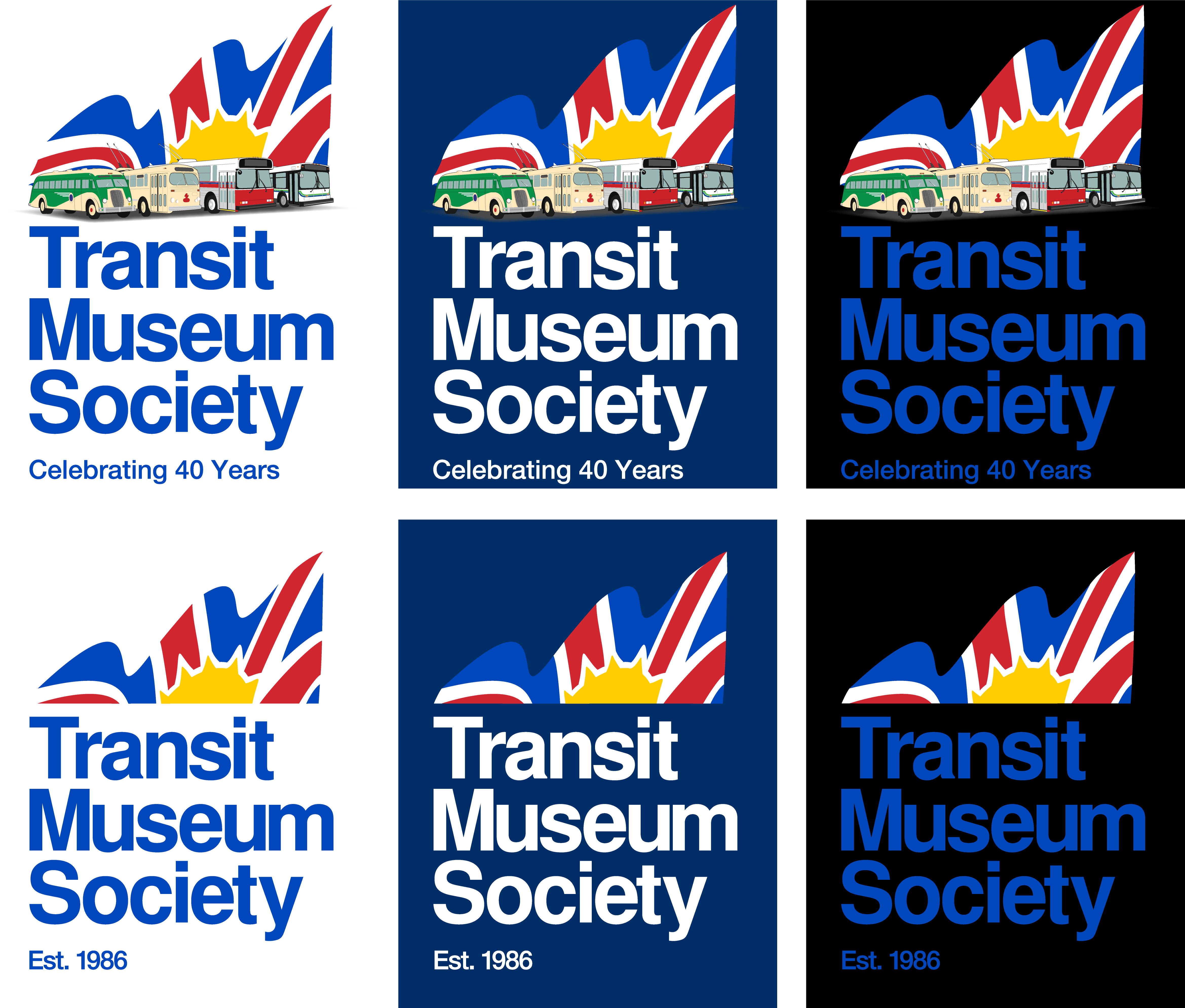
The bus illustrations were chosen to represent the three most iconic units in the society’s collection: a late 1930s motorcoach, a 1940s trolleybus, and the mid-1990s diesel transit bus it often brings to community events throughout the Lower Mainland; as well as a mid-1980s trolleybus to represent the state of public transit at the time of its founding.
Design Creation
After making satisfactory edits to the draft, it was determined that two variations of the design was necessary for it to be used in various applications. The main variation, with the bus illustrations and “Celebrating 40 Years” text, would be suitable for larger prints such as apparel and décor, but the intricacies of those elements may not scale well when applied to smaller surfaces, as found on stationery and certain giftware.
Thus, a second variation was created, eliminating the bus illustrations and simplifying the text to “Est. 1986”. Additionally, two different variations were made of the BC flag in the design: one with the white areas left transparent for application on white surfaces, and another with them filled in for application on coloured surfaces.
Final Outcome
Two variations of a scalable vector design, inspired by the BC Transit logo circa 1986
Challenges and Learnings
Even though the original plan was to create a single design, it became apparent that it wouldn’t work since the intricacies could only scale so much. This is why the second variant was added.